 Eximee Team
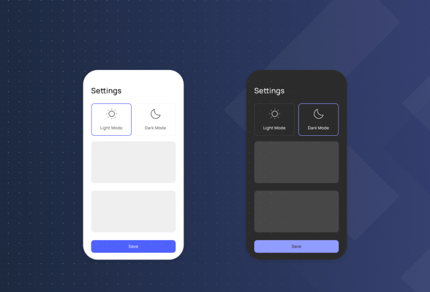
Dark mode is becoming increasingly common in apps and browsers. It offers many benefits, such as enhancing user comfort, aligning with the system’s interface, and meeting the needs of users who prefer less intense screen lighting. Major brands and platforms like Apple and Instagram have adopted dark themes, highlighting their impact on user engagement and metrics such as bounce rate and session length. For many, it’s the default; they can’t imagine using an app without it.
However, implementing dark mode isn’t as simple as it might seem. It’s a nuanced process, especially in banking, where aesthetics, functionality, and security are critical. To create a dark theme effectively, careful consideration must be given to user experience and accessibility. In this article, we’ll show you how to design an effective and well-thought-out dark mode for your banking application. Introducing dark mode can be a strategic step in app development to improve user engagement and satisfaction.
Dark mode is a display option that uses an inverted color scheme, typically with white text on a black background. Dark mode is available on a wide range of devices, including smartphones, and is supported by both iOS and Android operating systems. It has many advantages: improving readability and comfort in low-light conditions, reducing eye strain, supporting users with visual impairments, and positively affecting battery life on mobile devices. Dark mode can save power and reduce power consumption, especially on OLED screens, making it particularly beneficial for mobile devices as it consumes less power and helps extend battery life.
According to research, 81.9% of users prefer apps that offer a dark mode option. The dark mode option can increase user engagement and is suitable for both mobile applications and websites. Today, dark mode is not just a matter of aesthetics; it’s an expected standard in modern interface design. When using dark mode in low-light conditions, it can make using the app less intrusive in an entire room by reducing the impact of lights. Optimizing images for dark mode is important to maintain clarity and comfort.

Light mode vs. dark mode
Banking apps are not ordinary tools; their users expect a lot from them. They must be refined down to the last detail, from accessibility and intuitive user experience (UX) to clear navigation and the highest level of transaction security.
Since financial applications require such careful, advanced design, it’s worth listening to users and focusing on the “low-hanging fruit" — simple features that significantly improve the user experience. One of these features is dark mode. Many customers report the lack of dark mode as a notable inconvenience in NPS (Net Promoter Score) surveys.
In the context of banking, dark mode significantly impacts user comfort, particularly in the evening, at night, or in low-light environments. Its presence helps maintain visual consistency with the device’s system settings, making interacting with the app feel more natural.
In interface design, the adage goes, “The best design is the one you don’t notice.” The idea is that nothing should distract the user from their intended actions. As part of a consistent and flexible UI, dark mode fits perfectly with this principle.
WCAG (Web Content Accessibility Guidelines) is a set of guidelines that define how to design accessible applications for people with disabilities.
Although dark mode is not explicitly mentioned in the standards, it can indirectly support accessibility. For some users, such as those with light sensitivity (or photophobia) for example, a dark interface can significantly improve the comfort level when using an application. Dark mode can also benefit users with visual impairments by improving readability and reducing eye strain, making content more accessible for people with various visual sensitivities.
Dark mode implementation should be consistent across all channels through which a user accesses banking services – both in mobile and web applications. The mobile app and mobile application versions may offer different dark mode options depending on the device and operating system. For example, Android users might have additional customization options, while iOS users benefit from seamless integration with their device settings.
In mobile applications, dark mode is typically triggered automatically based on system settings. Users can also switch between light and dark modes using the app’s menu or device settings, with support for both Android and iOS operating systems. It is important to use the latest version of the app to ensure full compatibility with dark mode features and optimal performance.
In web applications, the mechanism works a bit differently. Instead of relying on the operating system settings, the application reads the user’s browser preferences – specifically the prefers-color-scheme value. On some websites, users may need to log in and access dark mode features through the site’s menu or account settings, which can differ from the mobile app experience.
Implementing dark mode involves more than just darkening the background. It requires a comprehensive transformation of the application’s entire visual layer and thoughtful design and adjustment of every UI element. To fully support dark mode, software improvements and new functionalities are necessary, ensuring that the app operates smoothly and provides an enhanced user experience.
Dark mode is not just about aesthetics; it’s primarily about ensuring proper contrast and readability in various user environments. Key elements include custom components, which we’ll focus on in the next section, and a well-designed color palette. When working with color palettes and UI elements, it’s important to optimize images for darker backgrounds to maintain clarity and prevent eye strain.
For example, imagine a bank’s logo in a dark shade of navy or red that looks great on a light background. This is no surprise, as the logo was designed for a light UI. However, when switching to dark mode, that same logo can disappear entirely — it loses contrast and becomes difficult to read or invisible.
This issue doesn’t just concern logos or aesthetics – it’s primarily about usability. In banking applications, many visual elements serve specific functions – colors highlight important information, indicate statuses, or draw attention to key actions. For example, colored text may signal a warning, a new feature, or a significant transaction.
However, if that color doesn’t provide sufficient contrast against a dark background, the element becomes invisible or hard to read – directly impacting the user experience and potentially compromising the functionality of the entire application.
During the design process, it’s essential to create a consistent dark mode experience across all elements, ensuring that every component, from images to text, is visually optimized. Additionally, providing technical details and documentation for developers is crucial for successful implementation and ongoing maintenance.
So, how can you avoid this?
The solution to readability and visual consistency issues in dark mode is to use pre-designed, system-level color palettes. These palettes consist of color sets that easily match equivalents between light and dark modes, though colors may appear slightly different depending on the mode and platform.
Each color in the light palette has a corresponding counterpart in the dark palette — the hue remains similar, but the brightness is adjusted to suit the darker background. This ensures that UI elements remain legible and consistent, regardless of the selected mode. It’s important to maintain sufficient contrast between bright and darker backgrounds to enhance readability and reduce eye strain.
Such palettes are typically created using colors with the same hue but different brightness levels. Brightness is defined on a scale from 0 to 100, where 0 is black and 100 is white.
For instance, a dark green with a brightness level of 20 might look good in a light theme. To achieve a similar contrast in dark mode, use the same green with a brightness level of 80.
When designing UI elements, remember to optimize images for both light and dark palettes. Images should be saturated and adjusted to prevent eye strain and maintain clarity, especially when displayed on darker backgrounds.
Using a consistent color palette throughout an application ensures aesthetics, functionality, and accessibility. It is the foundation of a well-designed interface, regardless of the display mode.

Color palette designed for light and dark themes
Developing the right color palette is just the first step; the key lies in testing and validation. Once a draft palette is created, it’s essential to thoroughly check the contrast levels between individual colors from both a visual design and accessibility compliance perspective (e.g., WCAG guidelines).
Some of the most common issues when implementing dark mode are poor contrast and inconsistency across the platform. We discussed contrast in the previous section. Now, let’s focus on custom components.
What are “custom components”? They are non-standard, self-designed interface elements, such as buttons, forms, and input controls, that do not rely on pre-built solutions available in frameworks, UI libraries, or design systems.

Dark mode with an inconsistent component in a light color scheme
If a component is built without a platform-level style-switching mechanism, such as automatic switching between light and dark mode, it must be manually adapted for dark mode. Otherwise, it may remain in the light theme or display incorrect colors, disrupting consistency and negatively impacting the user experience.
To ensure seamless theme adaptation, software improvements and new functionalities are often required to support theme switching. It is important to provide clear details and documentation for developers to guide the implementation process and avoid common mistakes.
For this reason, it is recommended that you use components that natively support theme switching. This approach significantly simplifies project scaling, accelerates implementation, and reduces the number of potential errors. Additionally, make sure the menu allows users to easily switch between modes and access all functionalities, ensuring a smooth and intuitive user experience.
For many users, dark mode is no longer just an optional feature; instead, it’s an expected standard. Although implementing it may seem simple, it’s important to ensure from the beginning of the design process that dark mode is easy to maintain, scalable, and consistent with the rest of the system. Adding dark mode as an afterthought at the end of the design process is a common mistake that often compromises application quality.
A well-designed, sleek dark mode enhances the user experience and positively influences the perception of the platform and brand as a whole. This not only helps increase user engagement but also strengthens the business’s brand image by aligning with modern UI/UX standards. Dark mode allows users to perform various tasks, such as checking balances or navigating features, more comfortably, especially in low-light environments, which can further boost engagement and satisfaction. Highlighting the range of tasks and features the app offers, along with continuous improvements, ensures users benefit from enhanced functionality, security, and overall experience.
Would you like to learn how Eximee’s low-code tools support the implementation of dark mode in banking applications? Contact us, and we’ll show you how we do it in practice.


