WCAG is a set of guidelines developed by the World Wide Web Consortium to improve the accessibility of web content for people with various disabilities. Its implementation is required by public and financial institutions as well as other entities. What does WCAG accessibility testing in institutions look like and what are the key things to know?
WCAG, or Web Content Accessibility Guidelines, is a set of guidelines developed by the World Wide Web Consortium (W3C) to improve the accessibility of digital content for people with various disabilities.
For a separate article that fully explores the WCAG and describes its history, click here.
The WCAG guidelines are based on four accessibility principles:
The WCAG guidelines consist of three levels of conformance:
According to current legislation in Poland, public institutions (including government agencies and public financial institutions) are required to comply with digital accessibility requirements, including WCAG, under the European Accessibility Act of 2019.
Ensuring web accessibility is the process of developing digital products in a way that allows the widest possible range of users, including people with different disabilities, to use applications freely. This means that applications should be designed to meet the needs of people with a range of disabilities, such as visual or hearing impairments, cognitive limitations, motor and developmental disabilities, and difficulties navigating the interface.
Screen readers are an absolute must when it comes to accessibility testing. A screen reader is software designed for blind or partially sighted users that enables them to read text displayed on the screen of a computer or mobile device.
For desktop applications, the most common choice is NVDA (available on Windows). For mobile applications, modern smartphones have this feature built in. On Android it is called TalkBack and on iOS it is called VoiceOver.
Before starting accessibility testing of desktop applications, it is important to ensure that the software is properly configured to facilitate navigation through the elements on the page.
The first important setting is the correct speech synthesiser. A recommended choice is the Microsoft Speech API version 5 built into Windows. The speech synthesiser selection can be found in the menu: Options -> Settings -> Speech -> Synthesiser.
Another setting to consider is highlighting the item on the screen where the focus is currently located. This option is very useful when navigating the page using the keyboard. You can find this option under Options -> Settings -> Visibility -> Visual Highlighting -> Enable Highlighting.
On Android, TalkBack can be enabled in the smartphone settings: Settings → System → Accessibility → TalkBack (the names in the settings may vary depending on the make and model of your smartphone). In the TalkBack menu, you can adjust the reader settings to suit your needs, from font size to colour inversion.
On iOS, it is similar: Settings → Accessibility → VoiceOver.
On Android, you should also set up quick navigation between headings. This is useful if a user wants to get to the bottom of the page quickly. In such a scenario, navigation through headers allows the user to skip items that are not headers. Swipe up/swipe down gestures are used for this type of navigation.
It is worth noting that this gesture can be assigned not only for navigation through headers but also for various other options, including speech rate, navigation through: words, lines, paragraphs, etc.
To assign a setting to this gesture, with TalkBack enabled, perform the check mark gesture → ✅ (up – down – up). TalkBack will then cycle through the available options with each gesture performed. The most common choice is headers. Once this gesture setting is assigned, you can use the swipe up/swipe down gesture to navigate only through the headers on the page.
First and foremost, it is important to understand the “theory" of accessibility testing. Before moving on to the practical side, we need to understand what constitutes incorrect behaviour, for example: which element should have focus when entering a website, what the correct order of focus elements should be, and whether a particular element actually reflects its intended role.
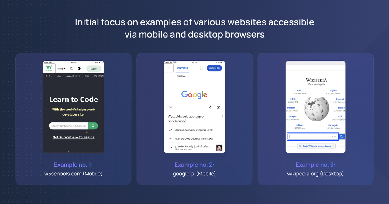
Initial focus refers to the first interactive element (e.g. form, button, link) that receives focus when a web page loads. It ensures that users who navigate using a keyboard or assistive technologies (e.g. screen readers) can easily access the first interactive element on the page.
As shown in the examples below, when a user enters a page, the focus is set on the first available interactive element. In example no. 1 this is a link to the home page, in example no. 2 it is the navigation menu, and in example no. 3 it is the search field.
Examples of initial focus
A focus trap prevents navigation outside of a specific area of a web page. For example, when a user performs an action that triggers a dialogue box, they should not be able to navigate to elements on the “layer" below the dialogue box. Navigation gestures and focus movement should only occur within the boundaries of the dialogue box. If the user tries to move outside this area, the focus is returned to the first element in the container.
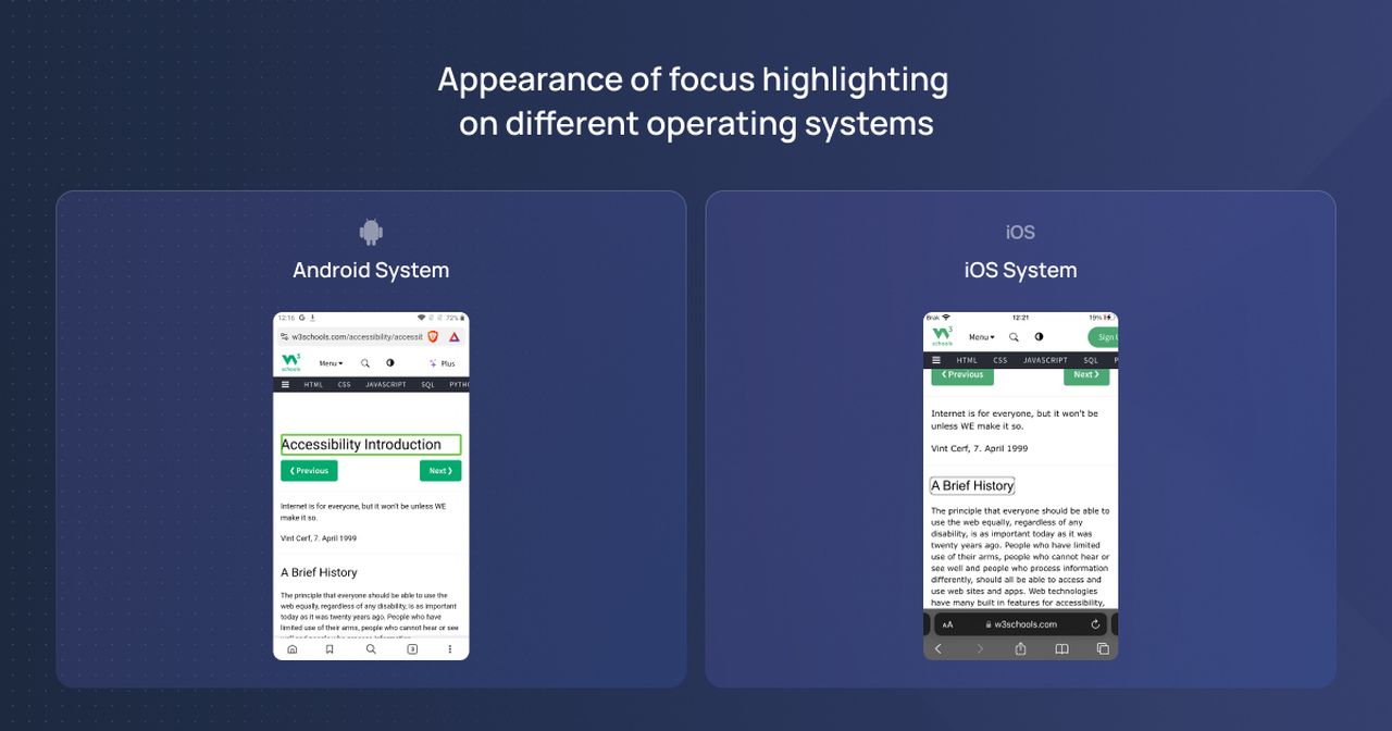
When entering a page with a screen reader enabled, a visible outline should appear to indicate the current focus on the page.
On smartphones with the Android system, the focus highlight looks like this:
Appearance of focus highlighting
On smartphones with the iOS system, the focus highlight appears differently, with the outline being black.
On mobile devices, navigation through elements on the page is done using gestures. The basic gestures used for navigation are called swipes. To move to the next element on the page, perform a swipe gesture to the right on the smartphone screen – the focus (outline) should then move to the next element in the DOM. Similarly, to go to the previous element on the page, perform a swipe gesture to the left.
When the focus is set on a selected interactive element, such as a button, performing a double-tap gesture on the screen confirms the selection, and the chosen action will then occur.
Important:
It is not important where on the mobile device’s screen the double-tap gesture is performed (the double-tap does not need to be performed directly on the element). As long as the focus is set on the element where we want to perform the action, performing the gesture will trigger the desired action.
NVDA has several modes, including the interactive mode and the form mode. The most commonly used mode is the interactive mode, as it includes all the functionalities of the other modes – it can be considered an all-in-one option.
When using the interactive mode (also called reading mode), once you start navigating interactive elements using the “Tab" key, NVDA will automatically switch to the form mode.
There are certain differences between NVDA and TalkBack/VoiceOver. On mobile devices, screen readers set focus on all elements (e.g., buttons, links), whereas when navigating with a keyboard while using NVDA on desktop, the user decides which content they want to navigate through.
For navigation through interactive elements, the ‘Tab’ key is used. Pressing this key will move the focus to the next interactive element. To move to the previous interactive element, the ‘Shift + Tab’ combination is used.
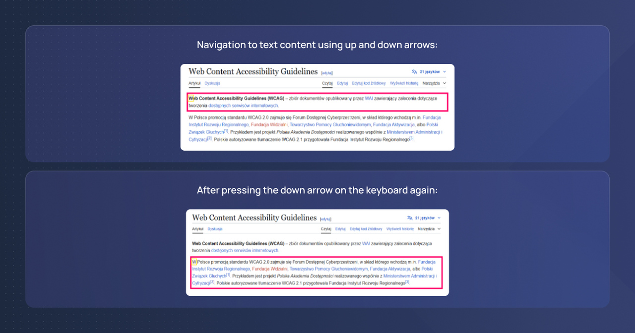
Text content can also be focused on (from top to bottom on the page) using the arrow keys on the keyboard.
Arrow keys up/down: focus will be set on each element on the page, one after another.
Examples of arrow keys up/down
As shown in the above example, the focus moved from one element to another located below it. Once the focus is set on a specific element, NVDA will announce all the content and read out everything within the red outline.
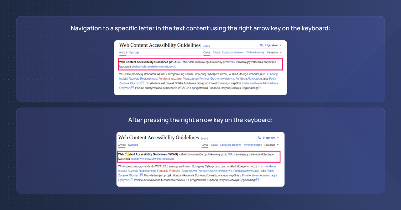
Arrow keys left/right: in the case of text content, focus will move letter by letter.
Examples of arrow keys left/right
Each time the right arrow key is pressed on the keyboard, the focus (yellow outline) will move to the next letter in the text content. NVDA will announce the letter by letter.
A useful shortcut for navigation is navigating by headings. To navigate by headings on the page, use the letter ‘h’ on the keyboard. After pressing the letter ‘h’, the focus will be moved to the next available heading. Similarly to the previous shortcut, ‘Shift + h’ is used to move to the previous heading.
Interactive elements in desktop browser versions are typically confirmed with the ‘Enter’ and ‘Space’ keys on the keyboard. However, there is a rule stating that links must be confirmed exclusively with the ‘Enter’ key, while buttons can be confirmed with both ‘Space’ and ‘Enter’.
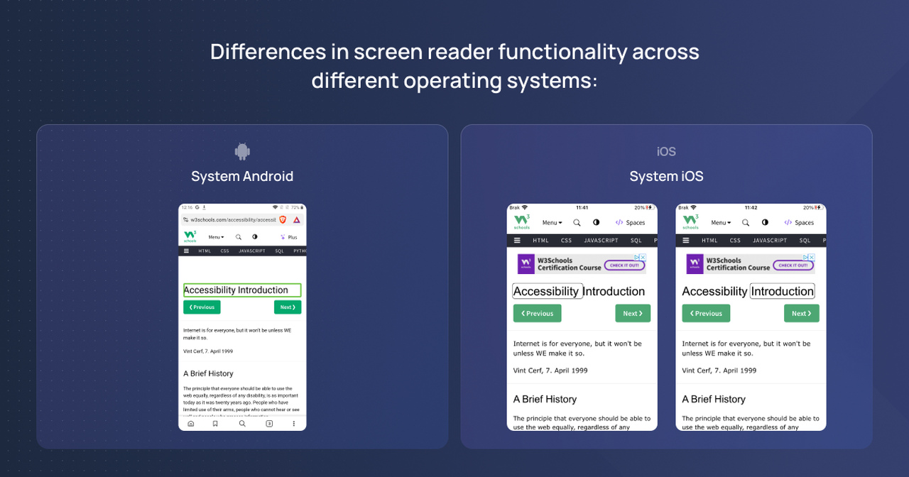
Although the subject of accessibility tests is the same webpage, sometimes screen readers on mobile devices (Android vs. iOS) tend to behave differently. Therefore, one must be vigilant about these differences. For example, let’s consider the w3schools website:
Differences in screen reader functionality
On the Android system, the element with the text “Accessibility Introduction" is focused as a whole (as one element) – this is evident by the focus frame. Additionally, TalkBack announces this element as “Accessibility Introduction, Heading 1," which makes this behavior correct.
On the iOS system, however, the situation is slightly different. The same element is focused in a different way (VoiceOver treats it as two separate elements). In this case, VoiceOver announces the same heading differently, first reading “Accessibility, Heading Level 1," and only after moving to the next element does it announce “Introduction, Heading Level 1."
Accessibility testing on mobile and desktop devices is a crucial element to ensure that applications and website accessibility is achieved for users with various disabilities and to identify potential accessibility barriers . To conduct effective testing, it is important to consider various aspects such as the focus order of elements and proper announcements by screen readers.
It is also important to remember that accessibility should be part of the development process – the earlier accessibility issues are addressed, the easier it will be to avoid costly fixes at a later stage. Implementing WCAG standards at the UX/UI design stage is highly recommended to mitigate any legal risks associated with accessibility compliance .
Assistive tools, such as screen readers, are helpful in verifying digital accessibility, though the best way to assess accessibility is through testing with actual users who rely on assistive technologies daily.